Dateline: A PowerPoint Template for Humanities and Social Science

A few months ago, I made available a PowerPoint template called Retrovisibility, which I’ve been using in history courses for many years. Today, I’m releasing Dateline, a completely new template for classes in humanities and social science disciplines. I’m publishing it under a Creative Commons license for free noncommercial use.


Uses

Dateline is designed to help instructors prioritize images and multimedia, not text. Inspired by the layouts used in television news, it includes subtle dynamic elements and friendly colors. It’s designed for use with the Braille Institute’s open typeface (or font) Atkinson Hyperlegible for high readability.

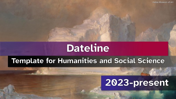
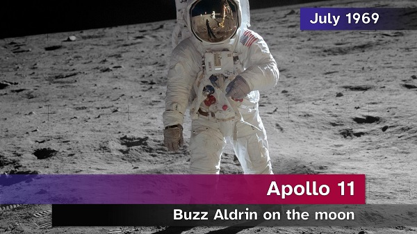
A distinctive element in Dateline is the inclusion of a placeholder for dates or date ranges. This is likely to be particularly useful to history teachers. But it may also be useful to instructors in other social science and humanities disciplines. (Potential uses in less chronological disciplines include, e.g., adapting APA citation conventions, listing page ranges instead of dates, displaying copyright notices, etc.) Text-centered slide layouts include a footnote element instead of the date placeholder.


Download

Dateline v. 0.9 (2023-05-06) (CC BY-NC 4.0) (6.85 MB)

Because WordPress.com does not host PowerPoint template (.potx) files, the template is provided as a presentation (.pptx) file instead. You will need to download it, delete the sample slides, and save it as a presentation template. Please click here for instructions about saving a PowerPoint template on your own computer.

This template is provided as-is. I cannot guarantee how it will work for any user.


Specifications

The best results are likely if you use a recent desktop edition of Microsoft PowerPoint on a Windows PC (both to prepare your presentation and to project it in the classroom). The template is designed for widescreen (16:9) displays.

Important: Dateline results in large file sizes for the slideshows you create. This is particularly true if you choose to include high-resolution background images. A slideshow for an hourlong presentation may become a 50+ MB file. This will be impractical for many users.

For the most consistent results, you should install Atkinson Hyperlegible on any computer you use to prepare slideshows with this template. Installing this font on your classroom computer, however, should not be necessary as long as you embed the font when you save a slideshow. (If you aren’t familiar with what it means to embed a font in a PowerPoint presentation, I recommend learning.)

If you use Dateline on computers running Windows, it should embed Atkinson Hyperlegible in your presentations by default when you save them. However, embedding fonts is possible for only some Mac users.


Feedback

If you’ve used Dateline and are willing to offer comments, please use the contact form. I’m grateful for any information that could make this template better.

Retrovisibility: A PowerPoint Template for History Classes

This post has been updated (April 28, 2023) with a link to version 1.0 of the template.

Almost a decade ago, I designed a PowerPoint template for use in my history courses. This summer, I rebuilt it from the ground up. Among other improvements, the new version of the template incorporates a new open typeface from the Braille Institute of America, Atkinson Hyperlegible, which should improve readability across different contexts.

I have decided to make this improved design available to other instructors and students under a Creative Commons license. I named the template “Retrovisibility.” It’s designed for the PC version of Microsoft’s PowerPoint desktop software.

Continue reading “Retrovisibility: A PowerPoint Template for History Classes”

PowerPoint Basics for Historians, Part 3

powerpoint-for-historians

Part 3: Creating Your Own Template

In previous posts in this series, I discussed some general design principles and some ways to ensure smoother delivery of PowerPoint presentations. Today’s post introduces the basic process of building a new PowerPoint template. (Remember, for clarity’s sake, all instructions in this series are written for Windows PC users. For additional instructions from Microsoft, try here.)

Brand-new PowerPoint users often rely on pre-made templates included with the software. They pick a template that looks attractive, add text and maybe some images, and voilà: a slideshow.

I have criticized PowerPoint’s off-the-rack templates already. They include a lot of unnecessary and distracting design elements. Because audiences see the same templates over and over, they turn into clichés. They also encourage bad habits. Pre-made templates seem ideal for displaying lots of text, which presenters will (proverbially) read aloud to the audience.

Fortunately, there is an alternative. With a little experimentation, this alternative will help you create PowerPoint slideshows that fit your unique combination of teaching style, subject matter, and favorite classroom exercises. Even highly experienced PowerPoint users may not realize how easily you can create and save your own template. You can custom-build it with all the specific elements you expect to need in a particular course or subject, then use it over and over just like PowerPoint’s pre-made templates. Here’s how.

Continue reading “PowerPoint Basics for Historians, Part 3”

PowerPoint Basics for Historians: Part 1

powerpoint-for-historians

Part 1: Design Fundamentals

This is the first installment of a series designed to help historians use Microsoft PowerPoint effectively in the classroom. (You may want to read the series introduction first.)

Today, I’m writing about the big picture of PowerPoint design. This post is about how to set up a slideshow to communicate in the classroom (or conference hall) clearly and effectively. It’s not really about the technology, per se—at this stage, we’re just talking about how to build a visual communication element into a history talk.

As you design your presentation, you should keep three core principles in mind:

  1. Minimalism
  2. Argument
  3. Flow

Continue reading “PowerPoint Basics for Historians: Part 1”

PowerPoint Basics for Historians: Introduction

powerpoint-for-historians

Let’s face it: If you teach or make other kinds of history presentations, you probably use PowerPoint.

Microsoft’s presentation slideshow software is more than thirty years old. It’s a standard piece of classroom technology. Students expect it. Instructors rely on it.

Yet many of us are sheepish about it. We complain about presenters who simply read their slides aloud. Some teachers warn that relying on PowerPoint is dangerous; a good professor, they say, can walk into any classroom and teach no matter what technology is available that day. Many claim the premise of PowerPoint is flawed because the lecture itself is an outdated teaching method. Also, a lot of presentations are really ugly.

There is some merit to all of these complaints. And there are other slideshow software programs on the market. But the chances are good that if you’re teaching history, you’re using PowerPoint anyway.

There are good reasons for that. PowerPoint is an excellent tool.

I learned some of PowerPoint’s virtues the hard way in my first training-wheels-off teaching job. Hired at the very last minute for a U.S. history survey, I hit the lectern before I even had a university email account or network login—and without the opportunity to assign books ahead of time. My students were lost for the first few days, my printed handouts notwithstanding. PowerPoint, when I could finally access the classroom computer, probably saved the course.

Lately, on course evaluations, students leave me a surprising number of comments like these:

img_1143img_1144img_1145

I’m certainly not claiming that PowerPoint is the only way to present history. But it can be a powerful way. Contrary to some critics’ expectations, using it effectively means more than simply projecting text on a screen. To use PowerPoint well is to design a more immersive narrative for your course. And your PowerPoint slides don’t have to be ugly, either.

In this series of posts, I plan to explain some of the things I’ve learned about using PowerPoint in history classes. Some of what I have to say is very practical–it’s about avoiding basic technical hiccups. Some is about graphic design. Some is specifically about using PowerPoint to craft a story and exhibit historical evidence.

Tomorrow, in my first post, I’ll begin with a few fundamental principles.