
Part 4: Images
The previous post in this series described how to create a custom PowerPoint template. Today’s post is about how to incorporate images more effectively into your slides. As always, for clarity’s sake, the instructions here are written for Windows PC users on fairly recent versions of the PowerPoint software.
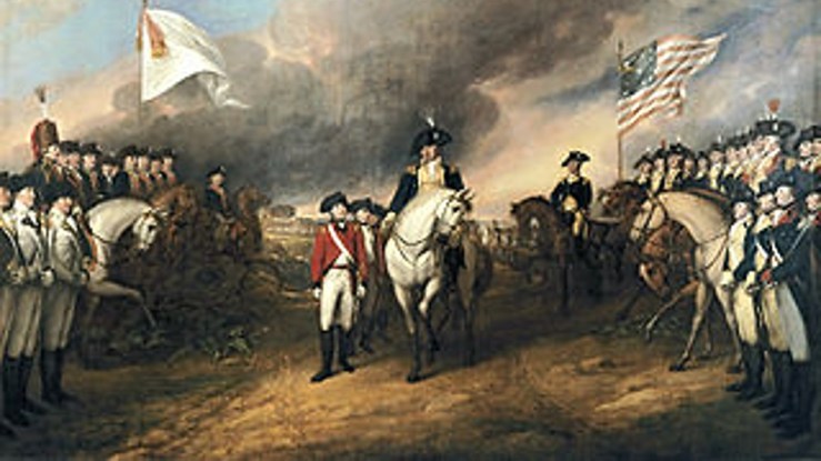
As a historian, no matter what kind of presentation you’re giving, you want to use images to help your audience see historically. In a classroom, you are training your students to be careful observers. So images shouldn’t be included haphazardly or for mere decoration. Whether you are using them as primary or as secondary sources, they are evidence for your students to learn how to interpret.
In using images this way, you’ll want to think about three key practical aspects of the way you present any image in your PowerPoint presentation:
- Size and shape
- Sharpness, brightness, and contrast
- Depth
Size and Shape
First—and most importantly!—use only images with a high enough resolution to be seen clearly at the size you want. For an image that will fill the screen, I usually look for something no smaller than 1200 pixels in width; this will display well on most projector screens today. Images that fill only part of the screen, of course, can be smaller. Regardless, make sure the image doesn’t look blurry or blocky at your chosen display size—not even a little.
Professors are often tempted to use images that are too small, enlarging them so they can be seen “better.” This temptation is strong because sometimes there is no high-resolution version of an image available. But the temptation must be resisted every time.
Low-resolution images destroy the professional credibility of the presentation and fail to accomplish what you want. They’re fundamentally distracting, and they make it impossible for your audience to see fine details or appreciate the information they should be conveying. Also, you should bear in mind that an image that looks marginally acceptable on your desktop computer screen often looks much worse on a big classroom projector screen. So with images, go high-resolution or go home.
In addition to size, you want to respect the image’s shape. When you resize an image, never change its proportions. Click and drag the corner of the image, not the sides. Or else right-click on the image, choose Size and Position > Size, and make sure to check the box called “Lock aspect ratio” when you use the sidebar menus to resize the image.
Squashed images, like blurry pixelated images, look tacky and distracting. Period.
But what if you want to use an image file that starts out too large? This can be a legitimate concern too. PowerPoint presentations full of high-resolution photographs can become enormous—I have some 80-megabyte PowerPoint files on my hard drive—and that can cause problems when you try to display them on slower classroom computers. And resizing or cropping an image inside PowerPoint doesn’t solve the problem of a large file size; the full image file is still saved inside your presentation.
There are a couple of ways to address this problem. The method most people know (and which is often best) is to resize the image in a separate program—perhaps MS Paint, which does the job just fine—and save the smaller image in a new, smaller file to use in your presentation. But sometimes you can also save time by “compressing” an image inside PowerPoint itself.
Here’s how that works. Double-click the image you want to change. That will bring the Format/Picture Tools tab at the top of the window into focus. Select Compress Pictures. In the box that pops up, check “Delete cropped areas of pictures.” Depending on the size of the original image, you may also have the option of changing the image resolution. If so, check the appropriate box—in general, the “Web (150 ppi)” option is easily good enough to use in your presentation. Then click OK. This will delete the cropped-out areas of the image and compress it so that the image is a smaller file.
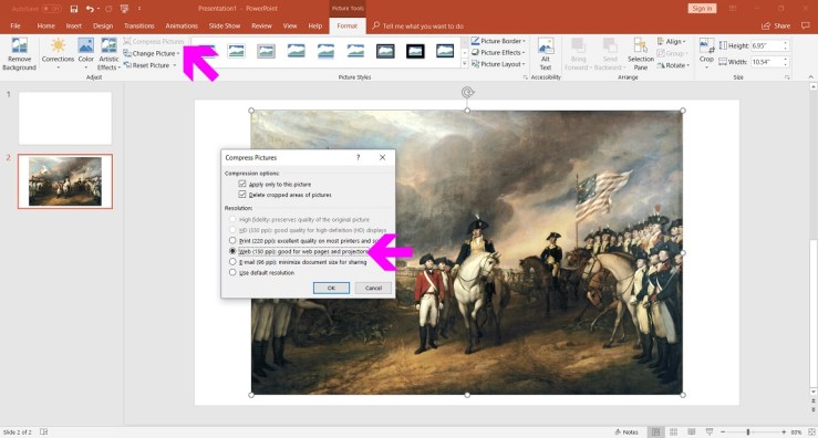
However, here’s a cautionary note: I have found that the image compression option does not always work properly. Sometimes, when I close and then reopen the presentation, I find that the compression tool weirdly squashed an image instead of deleting its cropped areas. You should double-check before giving your presentation.
Sharpness, Brightness, and Contrast
This is where, with a tiny amount of extra work, you can give your PowerPoint presentation a lot more zip and clarity.
If you have done PowerPoint presentations often, you have probably noticed that images that appear crisp and bright on your desktop computer monitor may not look that way on a classroom projector screen. Often your images turn out surprisingly dim; sometimes a lot of fine detail is lost. (Indeed, because projectors vibrate and screens drift in the air, most presentations will be ever so slightly out of focus despite your best efforts.)
One surprisingly effective way to solve this problem is to slightly increase the sharpness of an image. In other words, if you are worried about fine detail being lost, punch up the detail a bit—i.e., a bit beyond what you need to see the detail clearly on your own monitor. (If you overdo it, the image will start to look pixelated and grainy.)
This is really easy. Double-click the image. This will bring the Format/Picture Tools tab into focus in the ribbon at the top of the screen. Select the pull-down menu called Corrections. This shows you a grid of thumbnail images. The top row of thumbnails is Sharpen/Soften. The middle thumbnail shows the image without any alterations. If you move your cursor to hover over the thumbnails to the right, they will preview your image at 25% and 50% greater sharpness. If you hover over the thumbnails to the left, they will preview your image at 25% and 50% greater blurriness.
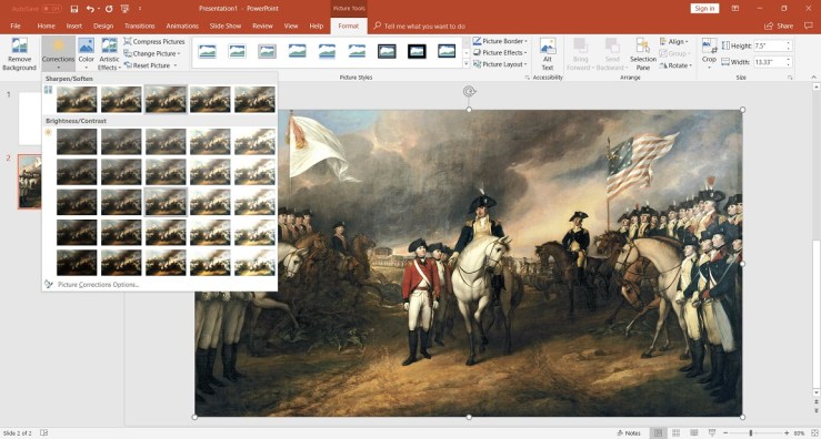
Ordinarily, to sharpen your image so that it displays well on a projector screen, 25% greater sharpness is perfect.
While you have this grid open, though, note that you also have options for changing the contrast and brightness of the image. In the Brightness/Contrast section of the menu, the thumbnail in dead center shows the image without any corrections. Each of the thumbnails around it will show a preview of the image at different settings (at 20% intervals).
Which brightness and contrast settings are best for your image will depend on a lot of different factors. You’ll have to make your own judgments based on what details you want your audience to see clearly and how your room’s ambient lighting is set.
Note that if you get ambitious, there are ways to change the sharpness, brightness, and contrast of the image in many more subtle degrees. But this is a post about PowerPoint basics, and most of the time the 125 different options in the Corrections menu are more than enough.
Depth
Sometimes you may want to display multiple images on the same slide. If you get creative, you may let them overlap each other a bit. This can look chaotic and distracting if you do it poorly. On the other hand, if you do it well, this gives you another way to enhance the way your presentation looks. It can also be a way to guide your audience’s eyes to where you want them, teaching your students to be observers.
A great way to do this is to layer your images so that your slide has a simulated foreground and background. You’re creating an illusion of depth. This is actually very easy if you pay attention to three aspects of each image.
First is the actual order the images are in. PowerPoint understands that each image you use (and actually, every element you use, including things like text boxes) is a separate layer on top of the slide background. You can change the order of the layers, putting some things in front of others. To do this with an image, right-click on it. In the menu that opens, select either Bring to Front or Send to Back, or hover over the arrows next to these options to move the image just one layer at a time (forward or backward).
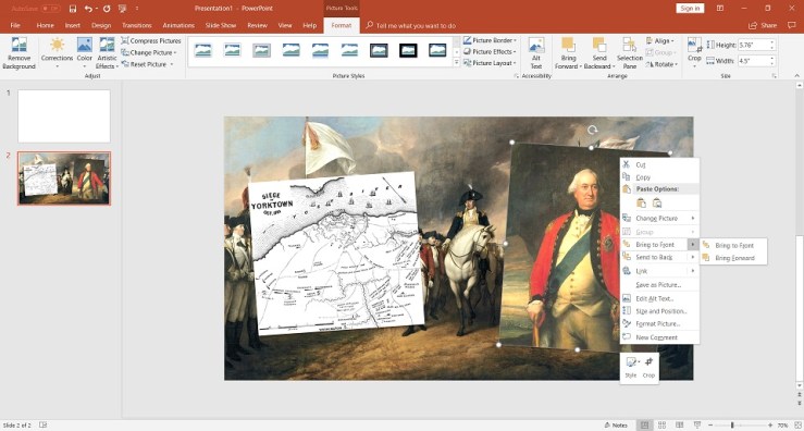
Second is the illusion of depth created by drop shadows. For an image that goes in front, double-click on the image, choose Picture Effects > Shadow, and choose one of the options to place a subtle shadow behind your image. (For the best results, choose the same shadow style each time, so that it looks like your images are being hit by a single consistent light source.) Your audience may not consciously notice the shadow, but it will give them the unconscious sense of depth.
Third are sharpness and brightness. For images in the background, if you don’t need the audience to see crisp detail, consider blurring the image, so that it looks slightly out of focus, and darkening it. Conversely, you may want slightly to increase the brightness and sharpness of an image that’s supposed to be in the foreground.
There it is. If you successfully take control of all of these things—size and shape; sharpness, brightness, and contrast; and depth—I think you have all the fundamental tools to produce a truly vibrant and professional image-filled PowerPoint presentation.
Next time: After a long break, Part 5 of this series will make the case for thinking like a filmmaker.
